 Dabble
Illuminate
A glowing visual language that lets patients draw and map their pain — turning a dismissed experience into clinical data.
The need
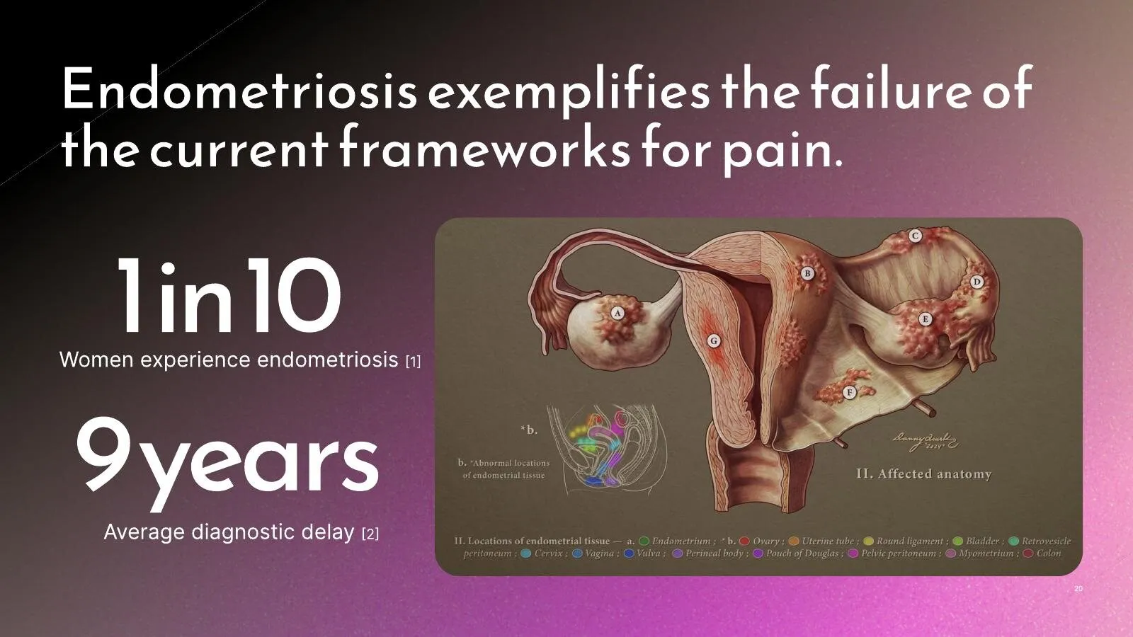
Pain has shape, movement, rhythm, and intensity — but the tools we hand patients flatten all of it into a single number from one to ten. That gap costs people care. Women with conditions like endometriosis are routinely dismissed and misdiagnosed; the average diagnostic delay stretches to nearly a decade. When the only available language is a number, the most human parts of the experience never reach the clinician.
The approach
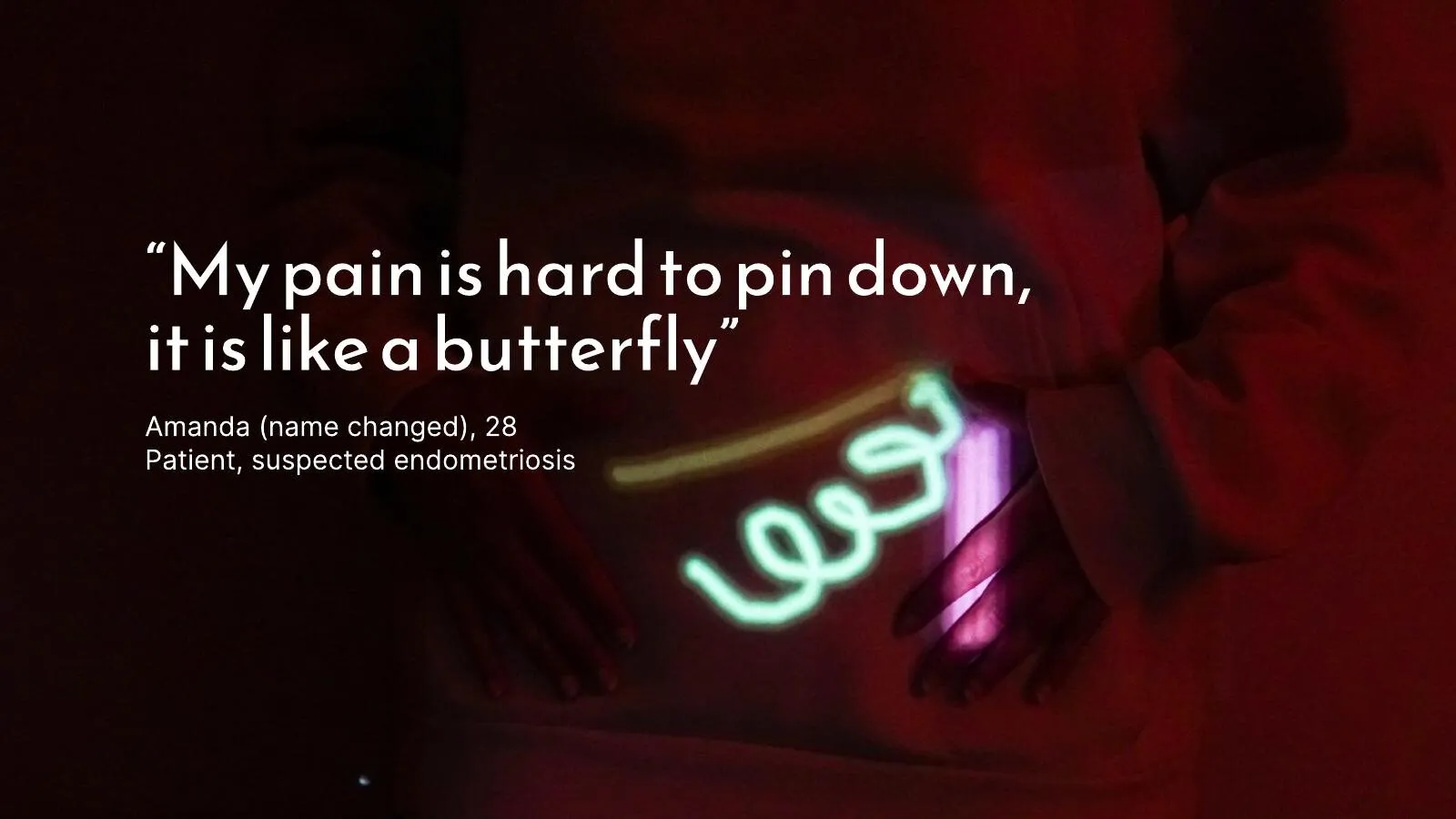
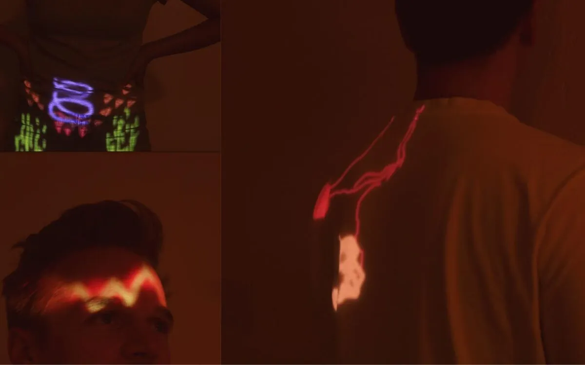
Rishika worked directly with patients and clinicians at UCSF and Stanford Medicine to find what a number leaves out. Instead of asking people to rate their pain, Illuminate asks them to draw it — on a dark canvas, with glowing, layered, animated strokes that capture where pain lives, how it moves, and how it changes over time.
- Interviews with patients and pain specialists to surface what’s lost in translation
- A drawing tool built around expression, not scoring
- A record designed to be read by both a person and a care team
The artifact
The result is a working tool for making “pain’tings” — embodied images of pain that double as longitudinal clinical data. Each drawing is a record over time, an expression of the individual experience and a dataset that has never existed before: a bridge between what a patient feels and what a provider can act on.
It’s now moving toward pilot studies with the Stanford Pain Management Center and Lucile Packard Children’s Hospital.
Why it matters
Illuminate reframes pain communication from a deficit (“rate it 1–10”) to a language. When people can finally show what they feel, they’re believed sooner — and care can meet the actual problem.
“My pain is hard to pin down — it is like a butterfly.”
Amanda (name changed), 28 — patient, suspected endometriosis